Rules and features of mixing two or more colors. How to get khaki color: what colors to mix and in what proportions? How to create white color
Modern interior design is full of original shades. The range of finished products does not always contain the desired semitone. The color mixing table will help you get the desired result at home. The information is useful not only when renovating an apartment. Knowledge of mixing colors is useful to a wide range of people: novice painters, car repair workers, decorators and other creative people.
Blending experiments: what you need to know in advance
The world around is filled with wide color palette, but all the colorful splendor is based on three primary colors: blue, red and yellow. It is due to their mixing that the desired semitone is achieved.
To get a new shade, use base colors in various proportions. The simplest example how to get green color. The answer is extremely simple: mixing yellow dye with blue. An illustrative table of primary, secondary and transitional colors obtained by mixing is presented below:
This table will help you understand that the question is how to get yellow, by itself is incorrect. It cannot be achieved by combining other components, since yellow belongs to the three main tones. Therefore, when a need arises for yellow, they acquire a ready-made dye or extract a pigment from natural products, which is not entirely advisable.

The same initial colors, taken in different proportions, when mixed, give a new result. The larger the volume of one dye, the final result after mixing will be closer to the original shade.
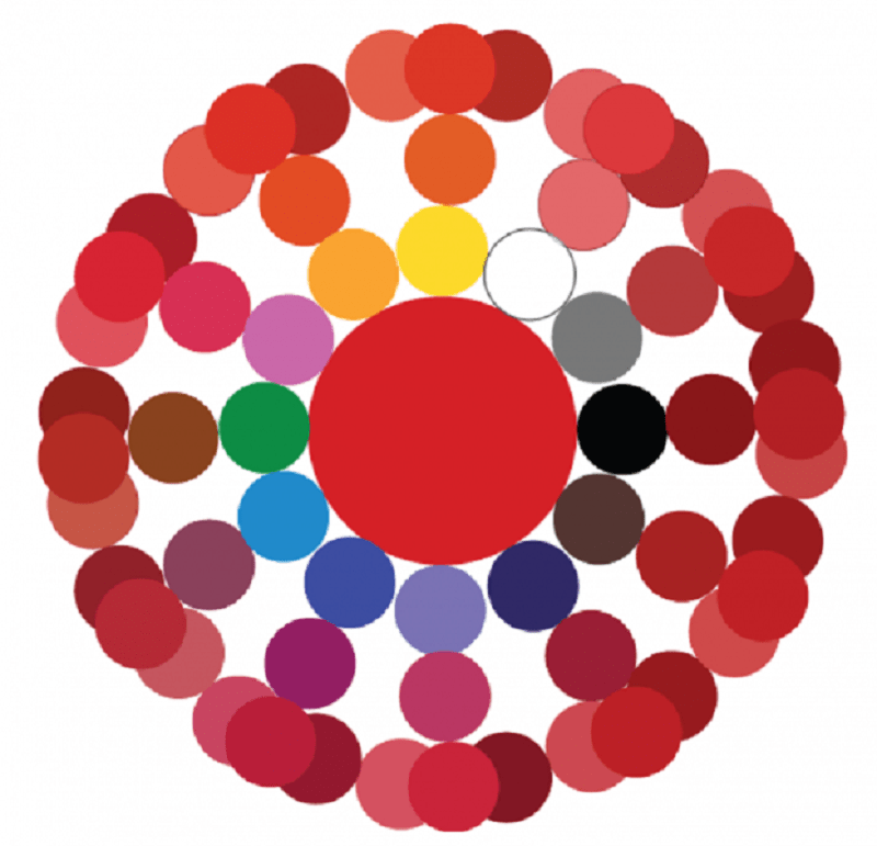
It is necessary to conduct experiments taking into account well-known rules. If you combine chromatic colors, which in color wheel are not far from each other, after mixing they get a paint with a pronounced chromatic tint, although not having a pure tone. The combination of dyes located on opposite sides leads to the formation of an achromatic tone, in which a gray tint predominates. The chromatic circle will help you navigate in the optimal combination of colors:

Attention! Mixing dyes does not always lead to a stable result. Some paints, when combined, provoke a chemical reaction, due to which the decorative coating subsequently cracks. There are cases when the desired background becomes gray or dark over time.
For example, if you take red cinnabar and white lead, the resulting bright pink color will darken after some time. It is advisable to take the most limited number of initial paints to obtain the desired tone. When mixing, their compatibility must be taken into account. For example, dyes oil based sensitive to solvents. Darkening or quickly fading materials are best excluded immediately. A table of combinations that should not be used will prevent mistakes in the creative process:
Variety of shades of red
Red is one of the three original colors that make up the base. Therefore, even a minimal set of colors cannot do without it. However, the question of how to get red when mixing paints sometimes still arises. This is due to the fact that magenta is involved in printing, so creative searches for how to get red are natural. Everything is solved extremely simply: to obtain natural red, yellow is mixed with magenta in volumes of 1: 1.
The color scheme of red is diverse, therefore there are many combination options:

Comment! A beautiful purple color cannot be obtained by combining violet with red. The only way to achieve a bright shade is to find a red paint without yellow impurities and mix it with blue.
The following circle demonstrates the variety of shades of red. It is worth noting that the addition of white colors to any mixture leads to a lightening of the tone, and black to a darkening.
The following table will help you understand the names of shades of red:

Variations in blue
An equally rich palette of shades gives mixing with blue dye, which is part of the basic triad. Therefore, its presence in any set is mandatory. However, even a set of 12 paints sometimes does not meet the need for a true blue tone. The reason is color variations. The classic tone is called royal, and on sale it is often replaced by ultramarine, which is characterized by a bright dark hue with a slight presence of purple. So the question is how to get Blue colour no longer seems absurd. The way out of the situation is to add white to the base color in a ratio of 3: 1. Blue is obtained in the same way, only white is used more when combined.
An interesting color of blue with a moderately saturated result is obtained by combining a darkish ultramarine with turquoise.

- Equal volumes of blue and yellow dye will produce a dark blue-green tone. The introduction of white contributes to some lightening, but the brightness is reduced. The reason lies in the combination of three components, and the more of them, the more dull the color.
- To obtain turquoise, mix cyan blue and add a slightly smaller amount of green. This shade is also called aquamarine.
- The color obtained from equal volumes of blue and light green is called Prussian blue. With the introduction of white, the saturation decreases, but the purity of the hue does not go away.
- Blue with red colors in a ratio of 2: 1 give blue with a hint of purple. The resulting color is lightened by the introduction of white.
- Mixing blue and pink magenta in equal parts will give royal blue, which is characterized by unusual brightness.
- Darken blue is obtained by mixing it with black in a ratio of 3:1.
An assistant in mixing experiments will be a table with the names of shades of blue:

Variety of green
The original green is usually presented in all sets; in the absence of the desired dye, there are no problems with obtaining. Combining yellow with blue gives the desired green background. But any direction of creativity, be it painting, interior design or another option for decorating objects, requires a wide palette of green. The basic principle of all experiments is to change the proportions of the base colors, white or black dye is used to lighten or darken the background.
- The combination of blue and yellow with a slight addition of brown represents khaki. Green with a small amount of yellow forms olive.
- Traditional light green - the result of mixing green with white. Adding yellow or blue will help regulate warmth.
Attention! The quality of the original components affects the saturation of the green color. The more intense the base tones, the brighter the blending result will be.
- A yellow-green effect will be obtained by combining yellow with blue in a ratio of 2: 1. Reverse proportion will result in a blue-green tone.
- Dark green is achieved by adding half the black.
- A warm light green background is formed from a mixture of white, blue and yellow paint in a ratio of 2:1:1.
A variety of colors of green hue demonstrates a circle. The base dye is located in the center, then there is an additional component, after - the result of mixing. The last circle is the experiments of the resulting tone with the addition of white and black dye.

The next table will become an assistant during the experiments.
Other color combinations
The color kaleidoscope is not limited to the combination of basic dyes. For example, gray is often required. Different proportions of white and black pigment will give a wide achromatic palette.
How to get ivory? The base will be white, ocher and dark brown are gradually added to it in small portions. Ocher contributes to the manifestation of warm tones, an increase in brown leads to a cold background.
Another table shows many blending options:
How to get black color? By combining cyan, yellow and magenta. They are not always available, so three basic dyes will become an assistant. Combining green with red will also give some semblance of black, but it will not be pure.
Conclusion
Even if you didn’t find a description for which question, tables will be of help, which not only provide recommendations for mixing, but also clearly demonstrate the result of the experiments. The results of our own mixing experiments may differ slightly from those stated above, it all depends on the composition of the dye and the surface on which it is applied.
Khaki is a light shade of tan, but usually khaki includes a whole range of different tones, from greenish to dusty earthy, combined under the concept of "camouflage color" or camouflage. This color was often used by armies around the world for military uniform, including camouflage. The word for color appeared in the middle of the 19th century thanks to the units of the British Indian Army. They used the Hindi word "khaki" referring to the color of their uniform. Light brown uniforms were preferred because they didn't show dirt, but the main reason why all colonial units of the British Army eventually wore khakis was because the shade made great camouflage. In Western fashion, this is the standard color for casual dresses and casual trousers. The military uniform itself is also often referred to as khaki.
The origin of khaki paint
The word "khaki" is a borrowing from Hindustani, where it came from Persian. It denotes the color of the soil, a yellowish-earthy shade. The word "khaki" was first used as the name of a color in 1848. Designation grey-brown this word appeared in English language thanks to the British Indian Army. Initially, the border troops were dressed in their native costume, which consisted of a dressing gown and white pajama trousers made from coarse homemade cotton, as well as a cotton turban. But this ensemble was too inappropriate for the hot climate and very conspicuous. Details of local recruits' clothing were too bright and poorly ventilated.

Then, as an alternative, they were offered a material painted with a greyish-yellow paint made from mulberries (mulberry). Clothes dyed light brown helped to blend in with the background environment. Before khaki, the stems and inflorescences of the mulberry tree were collected, and then an extract was made from them. It is believed that this dye was previously used by Afghan tribes for camouflage. The khaki fabric dyed in this way was usually linen or cotton. The cooler and nicer khaki camouflage uniform proved its superiority and was eventually adopted as active service summer wear by all regiments in the region - British and Indian. In 1902, the khaki uniform became the official service dress of the British Continental Forces.

Neutral shade of khaki in the fine arts
Khaki is very popular in fine arts and is actively used by artists. It is a bit like raw umber, which is needed for underpainting or to muffle bright colors, and also as a base tone for skin, painting tree trunks, earth. Hue is valued for its relative neutrality. The question of what colors to mix to get a khaki color often worries aspiring artists. When you look at the color wheel, the right shades are opposite each other. are blue and orange, red and green, yellow and purple. Mixing any of these pairs will help create base browns that are slightly different from each other.

Using oil or acrylic paints is quite easy to get. But it can be problematic to achieve a certain shade of khaki. Most often, a mixture of brown and green is used to obtain this complex color. After obtaining a tone close to the desired one, a black or yellow tint is added. If you add black or white, you can lighten or darken the paint. Which colors to mix to get khaki depends on the desired result. But mixing basic colors, it is impossible to create the desired shade immediately. Therefore, before you get a khaki color, you should mix the paints in the same way as for brown. Then you will have to add other shades to the resulting color scheme to make it darker or lighter.

How to get khaki color when mixing paints
One of the most simple ways create a basic Brown color- mix all primary colors. This means that you are using a palette knife to mix the blue, yellow and red together. Another way to get khaki is to mix raw umber and in this case the result will be close to a pale French gray, a warm green-gray. As an example, consider the Venetian stucco walls in khaki.

The first method is more often used - carefully mix all the primary colors. You can make subtle transitions neutral shades from a mixture of basic. If you use the color wheel, you need to take which are located one opposite the other. Since khaki has a yellowish tint, green-yellow, for example, cadmium yellow paint, is the central component in the mixture. Using it, you can get the desired color by adding cold red tones, warm bluish, warm white, titanium white, ultramarine blue.

What acrylic paints to mix for khaki
The question of how to get khaki color and mixing what shades will help to get closer to solving this problem, we have already considered. Now let's try to create the desired shade using acrylic paints as an example. For work, we need the paints themselves of several basic colors: red, yellow and blue, as well as white. For our purpose, cadmium red, cadmium yellow medium, sky blue and titanium white are suitable. But you don't have to use these exact shades, try using a classic version of each primary color and opaque white paint.
We also prepare additional tools:
- brush;
- water to clean the brush;
- work surface for testing mixtures;
- palette for mixing colors;
- palette knife;
- paper towels to clean the paint from the palette knife between mixes.
How to mix acrylic paints for brown
Before getting the khaki color from the colors of the base palette, we place on it approximately the same size drops of red, yellow and blue, leaving a large number of spaces between each of them. Add white, then combine equal parts of each of the base colors. Mix them together with a palette knife. In the process, you will get a rich brown color from a cloudy mixture. Depending on the base shades used, the results may vary slightly.
Getting Khaki from Brown
After you have mixed the base brown, add some white color. First enter a small amount, less than the other colors you added to make brown. If you immediately add the same amount, you can lighten it too much. Now you have a basic, rather soft brown. Decide for yourself if it's close enough to the khaki you'd like to use for your painting. It often happens in painting that you need a more specific version of a color that will fit your vision. The resulting shade can be refined by adding more or less of any of the primary colors or white paint to it in order to change it to suit your needs.
Using blue and orange to create khaki
An alternative way to get khaki is to mix blue and orange. The resulting shade can be slightly changed by adding other colors. For example, to create more warm shade, add red to the mixture. To create a darker one - purple or green. Add tertiary colors for a more subtle color change.
How to change the resulting shade of khaki
If you don't get the shade you want, follow these easy steps to change your khaki color. You can use them to change the shade according to your needs. Before you get a khaki color that is close to the shade of coffee with milk, you can add white paint. Add a little at a time until you reach your desired tone. Using one of the primary colors can also help create the right color, from soft to rich. Adding red or yellow will make the khaki color warmer and lighter, while the blue shade will be cooler. To make it even warmer, experiment with adding red or yellow paint. You need to do this little by little. If you want a very light shade of khaki, the easiest way is to use a lot of light paint and a small amount of the base brown that you mixed earlier. Adding dark to light is easier than the other way around. You can increase or decrease the saturation and make the khaki color brighter by adding more of the base brown to the mixture. You can make it more muted by adding gray paint.
Getting a cool or dark shade of khaki
If the mixture becomes too warm, you can add blue paint to cool her down. One way to get khaki wood tones for winter trees is dark hair or fur - experiment with adding blue paint to the main mixture. If it gets too bluish, you can add a little more red and yellow. Next, we'll look at how to get a darker khaki color, for example, for twilight scenes or dark trees. For this, you should not use black paint, as it can create cloudy tones. A khaki color that is dark but still vibrant can be achieved by adding a dark blue, such as ultramarine, to the mix.
Using the CMYK Model
You can also find exactly the shade of khaki that you need using the CMYK color model. CMYK is an abbreviation for cyan, magenta, yellow, and black. Find the brown you want. Image editors can calculate the exact percentages of magenta, yellow, cyan, and black needed for that color and then blend them accordingly. Note that magenta, yellow, and cyan are more accurate primary colors, but they are not the standard for mixing paints at this time.
The color mixing table allows you to create a huge palette of bright shades from 3 basic colors. It is very exciting! The main thing is to choose the right colors according to the color mixing table.
Artist's Workshop: Magic Lessons
1. The combination of two neighboring colors of the spectrum gives shades with different intensities of these colors. For example, yellow and orange, when superimposed, give yellow-orange or orange-yellow, depending on which of these 2 colors prevails. If, in equal proportions, you mix 3 shades located next to each other on the color wheel, for example, yellow, red and orange, you will get the same orange, but more dirty.
2. When white is added to any color, its pastel shades of different intensities are obtained. 
3. Mixing in equal proportions 2 primary colors, which are separated by 1 shade on the color wheel, we get exactly the intermediate color that separates them. For example, red + blue = purple.
4. An equal combination of 2 contrasting colors (located opposite each other on the color wheel) always gives a gray with a hint of one of these colors. For example, red + green, blue + orange, etc. Interestingly, if you mix complementary colors in a ratio of 2/1, you get absolute gray (without additional shades).
5. 3 primary colors located side by side, when superimposed in equal proportions, also form gray, for example, green + yellow + orange. Pay attention to the striking pattern: harmonious color combinations(which you can get using the color wheel) when mixed, the shades included in them give grey colour- balancing, absorb each other.
Create new colors according to the paint mixing table
As we already know, there are only 3 colors that cannot be obtained by mixing others. But from them you can create all the other shades. These magical colors are red, yellow and blue. By the way, mixing them with each other in equal proportions, you can get black. How to create all the other shades of the palette, see the table:

The color mixing table and the color wheel are not only used in painting, they are simply indispensable for tinting and mixing. decorative plaster in construction, in perfumery and soap making, in dyeing fabrics, batik, etc.
The color spectrum: revealing the secrets of the rainbow
 Isaac Newton, passing light through a prism, received a multi-colored beam, called the spectrum. For the convenience of color combinations, the continuous line of the spectrum with all its transitional tones was turned into a circle. As you know, three main shades are distinguished in the color spectrum (red, blue and yellow), when they are mixed in pairs with each other, three more secondary ones are obtained (green, orange and purple). It is these 6 shades that form the color wheel, and each of them has additional colors (blue and red-violet, yellow-green, purple, red and yellow-orange, blue and yellow-green). Newton, by the way, singled out 7 colors, adding blue to the spectrum, which, along with the six main ones, is considered the color of the rainbow. By mixing these shades, making them darker or lighter to varying degrees, you can get a full range of colors.
I would like to immediately make a reservation that the division of the spectrum is conditional and depends on the characteristics of our perception. A person can distinguish up to 1000 tones in the color spectrum. Interestingly, reptiles and birds do not distinguish shades of blue, and some fish see everything in red. It is believed that for cats, the colorful world around us looks dimmer, but they distinguish a huge variety of shades of gray.
Color Spectrum Table
 The colors of the spectrum are called chromatic as opposed to achromatic (from Latin "without color"): white, black, gray. The order of the hues in the spectrum is always the same, starting with red and ending with purple.
Shades on the color wheel from green-blue to blue-violet are considered cold, from yellow-green to red-violet - warm. This division is rather arbitrary and depends on what associations these colors evoke in us: red-orange fire, yellow sun, blue ice, blue oceanic abyss. Did you notice that when separating the colors, we didn't mention green? And this is no coincidence. Pure green (which, by the way, is extremely rare) is considered neutral. A drop of yellow makes it warmer, blue - cools.
 The color wheel is extremely important in the work of the designer. With its help, you can not only determine harmonious color combinations, create the right atmosphere in the room or an attractive image, but also influence perception by skillfully emphasizing the brightness, purity, beauty of color, enhance its intensity by adding complementary shades, balance cold tones with warm ones, etc. d. This magic is not difficult to learn even if you are not a designer, and you can apply it not only in interior design or clothing. With the help of the color wheel, anyone can create harmony in the apartment, correctly combine colors in clothes, manicure, makeup, etc. For example, Blue eyes orange-coral lipstick or peach shadows will emphasize, and a scarlet dress will refresh a green-turquoise scarf.
Decorating walls in a house or apartment is impossible without a creative approach. Ready-made paint shades do not always meet personal or customer requirements, so it is important to know which colors and in what proportions to mix to get purple. Violet lends itself to adjustments made by the introduction of light shades. The article discusses ways to obtain purple by mixing paints.

Obtaining purple from magenta, blue or cyan
The color spectrum perceived by the human eye and brain consists of three colors. Shades are formed by mixing red, blue and yellow. The color saturation effect depends on the amount of one of the three shades. This information provides an understanding that one color is formed by various variations of the primary colors. You can get rich purple from magenta. Magenta is a rich light pink color and well absorbs shades of green. After absorption, red and blue remain in the visible spectrum. When a part of blue is added to magenta, green and red are absorbed, and violet remains in the visible spectrum. The effect is explained by the receipt by color receptors of a strong signal from blue and a weak signal from red. The brain, combining the signals, perceives them as purple.
Advice! The brain perceives purple when cyan is added to magenta. Cyan covers the spectrum of red, leaving bright purple to be perceived.

A five-color printer will help in mixing shades. One of the subtractive colors in it is magenta. A drawing or a figure created in a graphic editor is not difficult to print. A sample is required to purchase paint with a magenta tint. The store makes a small dab of paint next to the sample for comparison. It is impossible to get magenta by mixing shades, because the color belongs to the main spectrum. The result of adding yellow to magenta in various proportions is a red and orange tint. When cyan is added, not only violet is formed, but also bright blue. The saturation of violet is varied by adding blue and cyan to the magenta without a greenish tint.
Making purple from pure red and blue

You can achieve a violet hue without using magenta. The result will be in the presence of pure blue and red colors. Determining their purity is important, because manufacturers add yellow and orange pigments to red paint tubes to get a rich tone. The blue paint container contains yellow and red pigments. If you mix containers with colors that are not pure, a dirty brown color is formed. You can check the purity of the color with white. To do this, blue or red is diluted in a glass of water. White is added to the aqueous solution. Diffusion shows shades of different colors. If you see peach in the case of red and aqua in the case of blue, then the colors are impure.
Note! Pure red, when mixed with white, forms pink, pure blue - blue.
It is convenient to mix pure colors on the palette. An equal amount of red and blue is poured into the cells, which are mixed with a brush. If the target is purple, then the blue part should be smaller. An extra bit of red will create a purple with a pink tint.
How to correct the resulting purple color

The color result is adjusted to obtain the desired hue. You can apply for this black white, dark blue, blue and pink. You can lighten the mixture with white. It does not matter how the result is obtained. A small amount of white added to purple makes it brighter. Increasing the content of white, pastel colors are formed. Black adds depth to purple. The substance is added gradually, in small doses, so as not to turn the main shade into black. It will not work to correct the result with whitewash, because adding white will make it gray.

At the right combination white and black, together with purple, lavender with a gray sheen is formed. For the predominance of pink, red or magenta is added. You can adjust the color to lilac with blue and cyan. An overflow of purple is formed in tandem with blue or cyan.

For the purity of the resulting shade when working with substances, clean containers and tools are required to collect the composition. The instruments are washed several times, because the remains of the components are not always visible on a dark background. If white remains, then the color will not be saturated, black will smear the result. Understanding the consistency and ratio comes with experience, so at first the arrangement of substances is done gradually so that you do not have to start again. On the palette, the substance may have one reflection, and on the canvas another, therefore, after mixing, part of the composition is applied to the edge of the canvas to compare the result. Mixing the components until the desired shade is formed is required not only by artists, but also, for example, by confectioners.

The effect of absorption can interfere with achieving results, so you need to add components with caution. Lilac belongs to the cold spectrum, so it is obtained by correcting violet with blue and red. Accompanying the correction with whitewash, the composition is saturated. Lilac can set off one of the components that was corrected, this can be compensated by saturated black, added interspersed with a brush.
Shades of purple: palette, color names

By experimenting with substances, you can get all 196 elements of the Pantone palette. As a result, one substance becomes bright, dull, saturated, purple, with a reflection of gray, lilac, bluish, with a pink overflow and others. Pastel colors fade into rich dark. The names of each of them are given in the diagram above.
Color Mixing Chart

Above is a table for obtaining each of the pigments shown on the left. Fashion encourages the use of non-standard pigments in the production of clothing, accessories and furniture. Understanding the principle of formation of shades will make it possible to convey the whole depth of mood in a picture or photograph. The artist achieves the result by expressing the mood by mixing the components. Chromatic substances are located side by side in the palette, achromatic components are located at a great distance. Mixing achromatic pigments adds a grayish sheen to the result. A video on how to get the desired shade is below.
The use of pigments will not give the desired result if they have a different chemical composition. Pigment components are capable of reacting, which can lead to fading of the composition during mixing. An example of this is the interaction of red cinnabar and white lead. The short term result will be a bright pink substance. When standing, the substance darkens and loses its properties. Oil formulations are mixed with oil. Solvent sensitivity is taken into account when processing surfaces. Mixing experiments are conveniently carried out with acrylic paints. This is due to their versatility. Acrylic compositions are applied and fixed on glass, concrete, canvas and paper, so it is easy to paint any surface with them. At the same time, to implement the idea, several colors will be required, among which there will definitely be white and black for adjustment.
Note! It is more difficult to get the desired result when working with large volumes of substances, so the ratio is calculated mathematically and checked practically, starting with drops.
Conclusion
As you can see, in most cases, it is not necessary to purchase the entire range of coloring compositions to create unique paintings or interiors. Fantasy and understanding of how some tones absorb others will make it possible to create exclusive solutions that will be difficult to repeat. After creating a masterpiece, even the author himself often finds it difficult to repeat the result obtained when mixing the components. A sense of proportion is important. The task of mixing components will be simplified by tools with applied scales. Thanks to the scales, it is possible to record which component and in what proportions was mixed.
2018-09-2104.06.2017
Color mixing features
In the interior of the premises, wall decoration is in vogue various types plasters and painting them with paints. But not always in hardware stores you can pick up your favorite palette. Do not despair. Modern technologies allow you to get the desired result. Mixing colors of standard shades allows you to get the desired result. The next question arises, how to mix paints to obtain beautiful tone? Let's try to get an answer.
There are quite a few tones. But the production of paints is based on the use of standard colors. Non-standard colors are now in vogue, which can be obtained by mixing dyes. How to mix colors correctly, the following recommendations from experts will suggest.
It has been known since childhood that the basis of all tones are three colors: red, blue, yellow.

For other options, you need to know the rules for mixing paints. The combination of basic dyes gives a wide range of different halftones.
The secret of creating a new color by mixing colors is the use of basic dyes in different proportions. For example, when you mix blue with yellow, you get green. If you continue to add yellow to the resulting substance, you can get tones that are increasingly approaching it. It all depends on the volumes that are connected.
On the video: how to get a new color.
The nuances of the connection of dyes
Mixing colors of chromatic shades, which are placed next to each other in the color wheel, give a fairly bright palette. If we mix dyes that are on opposite sides of the circle, we get achromatic tones, that is, with a predominance of gray.

To get the desired result, you need to understand not only color scheme, but also make sure that the solutions are suitable in chemical composition. Otherwise, you may get unexpected results. If the color, when mixing paints, initially turns out to be bright, then over time it begins to darken and gray. For example, the combination of white lead and cinnabar red color gives an initially bright pink, but after a while it will lose its saturation. This also applies to oil paints. They are very susceptible to solvents.
by the most the best option to achieve a high-quality saturated color scheme, it is necessary to combine the minimum number of colors. Comparability of materials is required. A color mixing table will help in their selection.

Traditional palette mixing options
When you get a color scheme yourself, you need to know the rules for mixing paints. Consider the common options for obtaining the desired color.
Red

Red is a representative of the main color scheme. To obtain various red shades, you must follow the rules:
- The tone of carmine, which is as close as possible to fuchsia, is combined with yellow 2: 1. The result is red.
- Combining pink with yellow, we get orange.
- To get scarlet, you need to take red and yellow in a ratio of 2: 1.
- To achieve a red palette with a soft effect, red and pink paint are mixed. To achieve a lighter tone, it is better to add white paint.
- If we add a dark dye to the main red paint, we get burgundy.
- Dark red can be achieved by mixing red and purple in a ratio of 3:1.
Blue

There are primary colors, which include blue. To obtain the desired blue tint, you must use this primary color. Blue is obtained by adding white to the blue palette. As the volume increases, the white shade will become lighter. To obtain a moderate tone, turquoise is used instead of white.
For getting blue flowers and shades, must be followed following scheme. Add to blue:
- yellow and get blue-green;
- red, in the end we get purple;
- orange will provide gray;
- black will make it possible to form dark blue.
Green

How to mix paints to get green and its shades. The basic rule is to mix yellow and blue dyes. Bright palette shades of green achieved by combining primary colors in different volumes and adding additional dyes. Complementary colors are black and white.

How to get khaki color? To do this, two elements are connected: yellow and blue, with the addition of brown tinting. For the result obtained, the amount of substance is important. Olive color can be obtained by taking green yellow tones. Making a mustard shade is more difficult. Red, black and a little green are added to yellow.